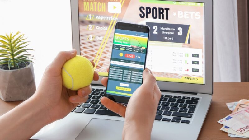

Tapping odds on a phone is second nature for many users. Glancing at a watch for a score or a cash-out prompt is becoming just as normal. A great cross-device experience turns core betting tasks into fast, readable, and trustworthy interactions that match the limits and strengths of each screen.
Map The Journey From Pocket To Wrist
Start with the moments that matter. On a phone, users browse markets, compare prices, and manage bankrolls. On a watch, they check a live score, see a cash-out value, or receive a discreet alert. Phones handle discovery and depth. Watches handle glance and confirm. Once the journey is clear, shape your sport betting guide as the connective layer that explains actions in plain language across both screens. Use deep links and shared state, so users can start on one device and finish on the other without friction.
Phone Screens: Design For Speed And Comparison
The phone is the decision hub. Give users clarity and low friction, then prove freshness with visible update cues. These essentials keep focus where it matters most:
- Large tap targets and a clear hierarchy for odds, stake, and potential return
- A bet slip that stays visible with quick edit and unambiguous confirm
- Numeric inputs with smart defaults and real time validation
- Line movement, last refresh time, and gentle price change prompts
- Simple bankroll tools that size a stake without leaving the slip
Keep copy tight. Show only the markets a user follows and let them pin favorites. Cache the last seen price and highlight changes, but never reset the stake when a line updates. Preserve intent and ask for a single confirmation.
Wearable Screens: Design For Glance And Confirm
Adoption on the wrist keeps growing. IDC reports Q1 2025 wrist-worn shipments up 10.5 percent to 45.6 million and smartwatches at 34.8 million up 4.8 percent. As more users check scores and cash out on the watch, design for short, clear interactions. Use this quick checklist:
- One metric per screen such as score, timer, or cash out value
- Big type, concise labels, and one or two taps to act
- Haptics that signal events or price changes without constant buzzing
- Clear accept or decline for adjusted prices with stake and return visible
- Complications that open directly to the live event

Do not move complex research to the wrist. When context is missing, offer “Continue on phone” to restore state and finish on the larger screen. Patterns from a flexible cross device ecosystem show wrist interactions work best when they stay brief and hand off cleanly to phone based research.
Data Freshness And Performance
Latency changes behavior. Push only the essentials to watches to preserve battery and keep refresh predictable. Phones can poll more often or subscribe to server updates. Cache team data and images to avoid blank states. Use skeleton loaders to set expectations during network delay. Mark the last update time, so users can judge when to refresh. When networks drop, preserve state locally and sync the moment service returns.
Notifications With Restraint
Alerts should serve the user, not distract them. Offer presets for event start, momentum swings, and cash out thresholds. Let users set quiet hours and choose vibration only. If the user is already on the match screen, do not duplicate every alert on the other device. Any alert should open to the exact event, not a generic dashboard. Give one tap to mute a noisy thread for the rest of the match.
Access For All, Trust By Default, And Meaningful Metrics
Design for everyone with readable sizes, strong contrast, and labels that do not rely on color alone. Support screen readers with logical focus order and control names that match on both devices. Use biometrics and two-factor authentication. Make fees and limits clear and add one extra tap before any irreversible action. Measure comprehension, not only clicks. Track time to place a bet, price acceptance, cash out response time, and the share of watch actions completed without fallback to the phone.
Closing Thoughts
Let the phone be the canvas for research and control. Let the watch be the shortcut that confirms or checks. Keep language simple, keep state in sync, and keep interactions short. With consistent design and honest safety features, your product will feel fast, coherent, and trustworthy on any screen.